Quickstart Tutorial
Hi! Welcome to \(\texttt{stella}\), a package to identify stellar flares using \(\textit{TESS}\) two-minute data. Here, we’ll run through an example of how to create a convolutional neural network (CNN) model and how to use it to predict where flares are in your own light curves. Let’s get started!
[1]:
import os, sys
sys.path.insert(1, '/Users/arcticfox/Documents/GitHub/stella/')
import stella
import numpy as np
from tqdm import tqdm_notebook
import matplotlib.pyplot as plt

plt.rcParams['font.size'] = 20
WARNING: leap-second auto-update failed due to the following exception: ValueError("Malformed URL: '//anaconda3/lib/python3.7/site-packages/astropy/utils/iers/data/Leap_Second.dat'") [astropy.time.core]
1.1 Download the Models
For this network, we’ll be using the models created and used in Feinstein et al. (2020). The models can be downloaded from MAST using the following:
[2]:
ds = stella.DownloadSets()
ds.download_models()
Models have already been downloaded to ~/.stella/models
[3]:
ds.models
[3]:
array(['/Users/arcticfox/.stella/models/hlsp_stella_tess_ensemblemodel_s004_tess_v0.1.0_cnn.h5',
       '/Users/arcticfox/.stella/models/hlsp_stella_tess_ensemblemodel_s005_tess_v0.1.0_cnn.h5',
       '/Users/arcticfox/.stella/models/hlsp_stella_tess_ensemblemodel_s018_tess_v0.1.0_cnn.h5',
       '/Users/arcticfox/.stella/models/hlsp_stella_tess_ensemblemodel_s028_tess_v0.1.0_cnn.h5',
       '/Users/arcticfox/.stella/models/hlsp_stella_tess_ensemblemodel_s029_tess_v0.1.0_cnn.h5',
       '/Users/arcticfox/.stella/models/hlsp_stella_tess_ensemblemodel_s038_tess_v0.1.0_cnn.h5',
       '/Users/arcticfox/.stella/models/hlsp_stella_tess_ensemblemodel_s050_tess_v0.1.0_cnn.h5',
       '/Users/arcticfox/.stella/models/hlsp_stella_tess_ensemblemodel_s077_tess_v0.1.0_cnn.h5',
       '/Users/arcticfox/.stella/models/hlsp_stella_tess_ensemblemodel_s078_tess_v0.1.0_cnn.h5',
       '/Users/arcticfox/.stella/models/hlsp_stella_tess_ensemblemodel_s080_tess_v0.1.0_cnn.h5'],
      dtype='<U86')
1.2 Using the Models
Step 1. Specifiy a directory where you’d like your models to be saved to.
[4]:
OUT_DIR = '/Users/arcticfox/Desktop/results/'
Step 2. Initialize the class! Call \(\texttt{stella.ConvNN()}\) and pass in your directory. A message will appear that says you can only call \(\texttt{stella.ConvNN.predict()}\). That’s okay because we’re doing to pass in the model later down the line.
[5]:
cnn = stella.ConvNN(output_dir=OUT_DIR)
WARNING: No stella.DataSet object passed in.
Can only use stella.ConvNN.predict().
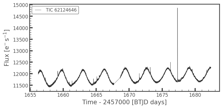
The easiest thing you can do is pass in your light curves here! Let’s grab an example star using \(\texttt{lightkurve}\):
[9]:
#### create a lightkurve for a two minute target here for the example
from lightkurve.search import search_lightcurvefile

lc = search_lightcurvefile(target='tic62124646', mission='TESS', sector=13)
lc = lc.download().PDCSAP_FLUX
lc.plot();
//anaconda3/lib/python3.7/site-packages/ipykernel_launcher.py:4: LightkurveDeprecationWarning: The search_lightcurvefile function is deprecated and may be removed in a future version.
        Use search_lightcurve() instead.
  after removing the cwd from sys.path.
//anaconda3/lib/python3.7/site-packages/lightkurve/search.py:352: LightkurveWarning: Warning: 3 files available to download. Only the first file has been downloaded. Please use `download_all()` or specify additional criteria (e.g. quarter, campaign, or sector) to limit your search.
  LightkurveWarning,
//anaconda3/lib/python3.7/site-packages/ipykernel_launcher.py:5: LightkurveDeprecationWarning: The PDCSAP_FLUX function is deprecated and may be removed in a future version.
  """
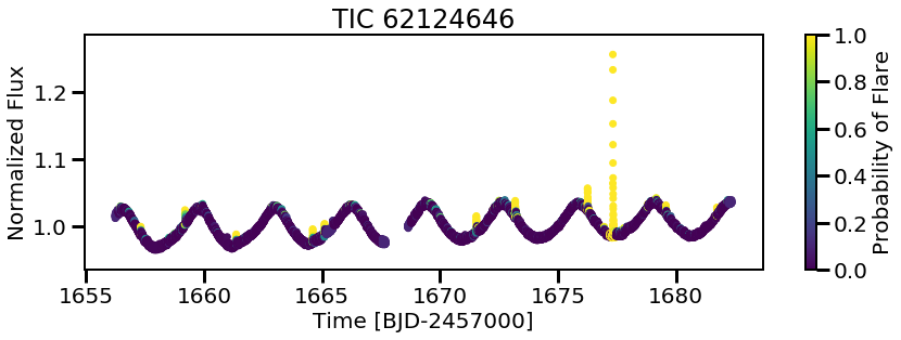
Now we can use the model we saved to predict flares on new light curves! This is where it becomes important to keep track of your models and your output directory. To be extra sure you know what model you’re using, in order to predict on new light curves you \(\textit{must}\) input the model filename.
[6]:
cnn.predict(modelname=MODELS[0],
            times=lc.time,
            fluxes=lc.flux,
            errs=lc.flux_err)
single_pred = cnn.predictions[0]
100%|██████████| 1/1 [00:00<00:00, 1.18it/s]
You can inspect the model a bit more by calling cnn.model.summary() which details the layers, size, and output shapes for the \(\texttt{stella}\) models.
[7]:
cnn.model.summary()
Model: "sequential"
_________________________________________________________________
Layer (type)                 Output Shape              Param #
=================================================================
conv1d (Conv1D)              (None, 200, 16)           128
_________________________________________________________________
max_pooling1d (MaxPooling1D) (None, 100, 16)           0
_________________________________________________________________
dropout (Dropout)            (None, 100, 16)           0
_________________________________________________________________
conv1d_1 (Conv1D)            (None, 100, 64)           3136
_________________________________________________________________
max_pooling1d_1 (MaxPooling1 (None, 50, 64)            0
_________________________________________________________________
dropout_1 (Dropout)          (None, 50, 64)            0
_________________________________________________________________
flatten (Flatten)            (None, 3200)              0
_________________________________________________________________
dense (Dense)                (None, 32)                102432
_________________________________________________________________
dropout_2 (Dropout)          (None, 32)                0
_________________________________________________________________
dense_1 (Dense)              (None, 1)                 33
=================================================================
Total params: 105,729
Trainable params: 105,729
Non-trainable params: 0
_________________________________________________________________
Et voila… Predictions!
[13]:
plt.figure(figsize=(14,4))
plt.scatter(cnn.predict_time[0], cnn.predict_flux[0],
            c=single_pred, vmin=0, vmax=1)
plt.colorbar(label='Probability of Flare')
plt.xlabel('Time [BJD-2457000]')
plt.ylabel('Normalized Flux')
plt.title('TIC {}'.format(lc.targetid));
Now you can loop through all 10 models provided and average over the predictions from each model. This is called \(\textit{ensembling}\) and can provide more accurate predictions than using a single model.
[9]:
preds = np.zeros((len(MODELS),len(cnn.predictions[0])))

for i, model in enumerate(MODELS):
    cnn.predict(modelname=model,
                times=lc.time,
                fluxes=lc.flux,
                errs=lc.flux_err)
    preds[i] = cnn.predictions[0]

avg_pred = np.nanmedian(preds, axis=0)
100%|██████████| 1/1 [00:00<00:00,  1.36it/s]
100%|██████████| 1/1 [00:00<00:00,  1.33it/s]
100%|██████████| 1/1 [00:00<00:00,  1.32it/s]
100%|██████████| 1/1 [00:00<00:00,  1.33it/s]
100%|██████████| 1/1 [00:00<00:00,  1.34it/s]
100%|██████████| 1/1 [00:00<00:00,  1.37it/s]
100%|██████████| 1/1 [00:00<00:00,  1.33it/s]
100%|██████████| 1/1 [00:00<00:00,  1.35it/s]
100%|██████████| 1/1 [00:00<00:00,  1.33it/s]
100%|██████████| 1/1 [00:00<00:00,  1.35it/s]
[26]:
fig, (ax1, ax2) = plt.subplots(figsize=(14,8), nrows=2,
                               sharex=True, sharey=True)
im = ax1.scatter(cnn.predict_time[0], cnn.predict_flux[0],
            c=avg_pred, vmin=0, vmax=1)
ax2.scatter(cnn.predict_time[0], cnn.predict_flux[0],
            c=single_pred, vmin=0, vmax=1)
ax2.set_xlabel('Time [BJD-2457000]')
ax2.set_ylabel('Normalized Flux', y=1.2)

fig.subplots_adjust(right=0.8)
cbar_ax = fig.add_axes([0.81, 0.15, 0.02, 0.7])
fig.colorbar(im, cax=cbar_ax, label='Probability')


ax1.set_title('Averaged Predictions')
ax2.set_title('Single Model Predictions')

plt.subplots_adjust(hspace=0.4);
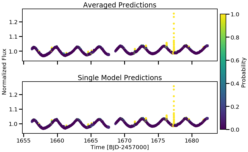
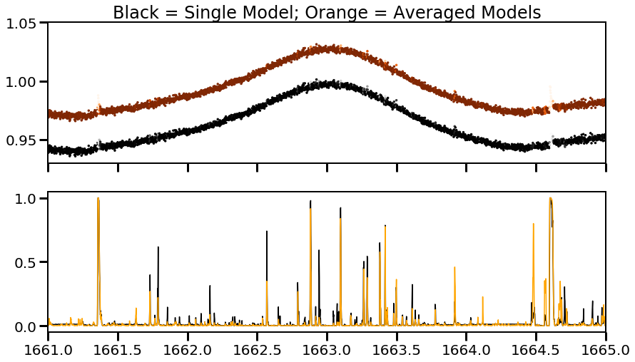
There might not be a huge noticeable difference here, but if we zoom into a noisier region and look at both the light curves and the predictions over time, we see that the averaged values do a better job at marking a lower probability for these regions. (It should also be noted that using the stella.FitFlares() function, these potential flares are not marked as real. See Other Fun Features for a demo on this class.)
[52]:
fig, (ax1, ax2) = plt.subplots(figsize=(14,8), nrows=2,
                               sharex=True)
ax1.scatter(cnn.predict_time[0], cnn.predict_flux[0],
            c=avg_pred, vmin=0, vmax=1, cmap='Oranges_r', s=6)
ax1.scatter(cnn.predict_time[0], cnn.predict_flux[0]-0.03,
            c=single_pred, vmin=0, vmax=1, cmap='Greys_r', s=6)
ax1.set_ylim(0.93,1.05)
ax2.plot(cnn.predict_time[0], single_pred, 'k')
ax2.plot(cnn.predict_time[0], avg_pred, 'orange')
ax1.set_title('Black = Single Model; Orange = Averaged Models')

plt.xlim(1661,1665)
[52]:
(1661, 1665)
[ ]: